
Results
1. Size of the City
- 30km


- 10km


As the city size increases, the intensity of x-wind and z-wind is higher. In addition, it is clear to confirm that the temperature also increased as the city size increased. Therefore, it is concluded that the larger the city size, the more serious the heat island phenomenon becomes.
2. Residential Intensity
- High residential intensity


- Low residential intensity


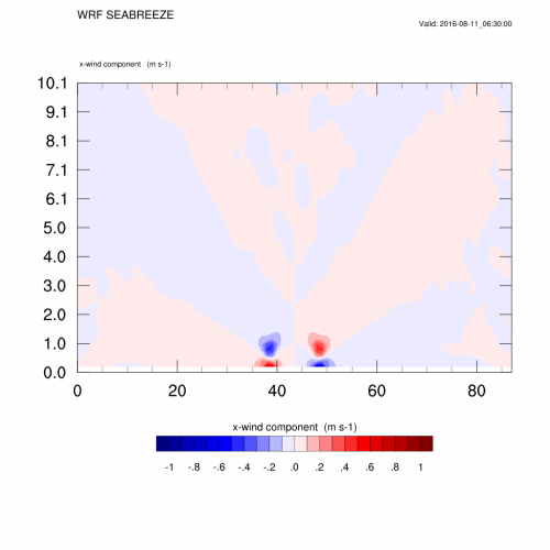
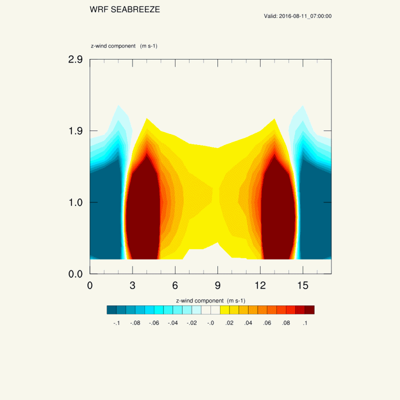
In z-wind graph, strong rises and falls occur continuously throughout the whole city. The width of rising motion is broader in the high residential intensity situation.
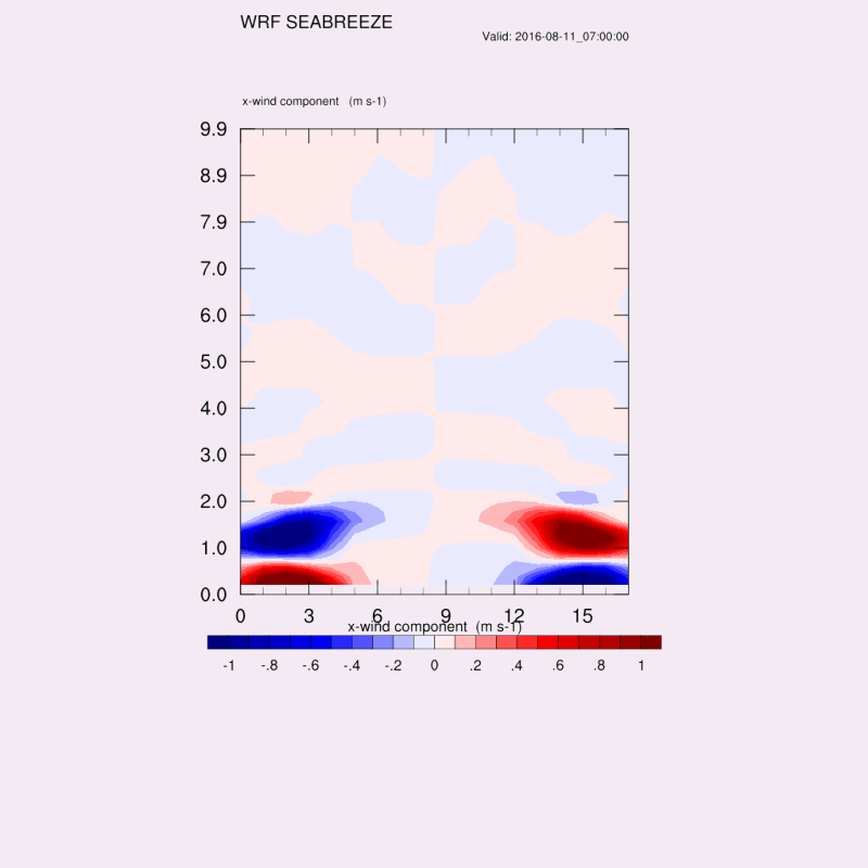
In u-wind graph, because the z-wind rising motion is stronger in the high residential intensity case at the center of the city, horizontal u-wind motion is little bit weaker at the center of the city in the low residential intensity case.
In temperature related graph, even though the temperature difference is very small, we can find out that the high residential intensity case has higher temperature than the low residential intensity case, and this will be much bigger when the size of the city becomes larger.
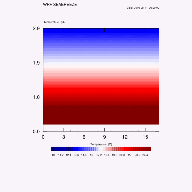
3. Location
- Seaside city
At around KST 15:00 on August 11, air flows can be seen from the outside of the city to the direction of the city's central area. Since then, a strong convergence has occurred in the center of the city, and it can be seen that the air flow has changed in the direction of the outskirts of the city around 21:00 on the 11th. Since then, the air has been converging again from 03:00 on the 12th, and at 15:00 on the 12th, it can be seen that strong convergence takes place in the center of the city again.
4. Distribution of Green Area
- grass in middle


- grass in side

In the graph on the left, the black line is the temperature graph on grid 5 in the city when grass in middle and the red line is the temperature graph on grid 5 in the city when the grass in side. It has a relatively similar temperature. However, considering the maximum minimum value, it can be seen that grass in middle (min = 22.1305 max =
35.3877) is lower than grass in side(min = 22.1876 max 36.3418). Therefore, when the area of grass is constant, the effect of the distribution of grass on the urban heat island phenomenon is minimal.